

Dark Bedroom Design Ideas: How to Make Moody Interiors Work
7 min read
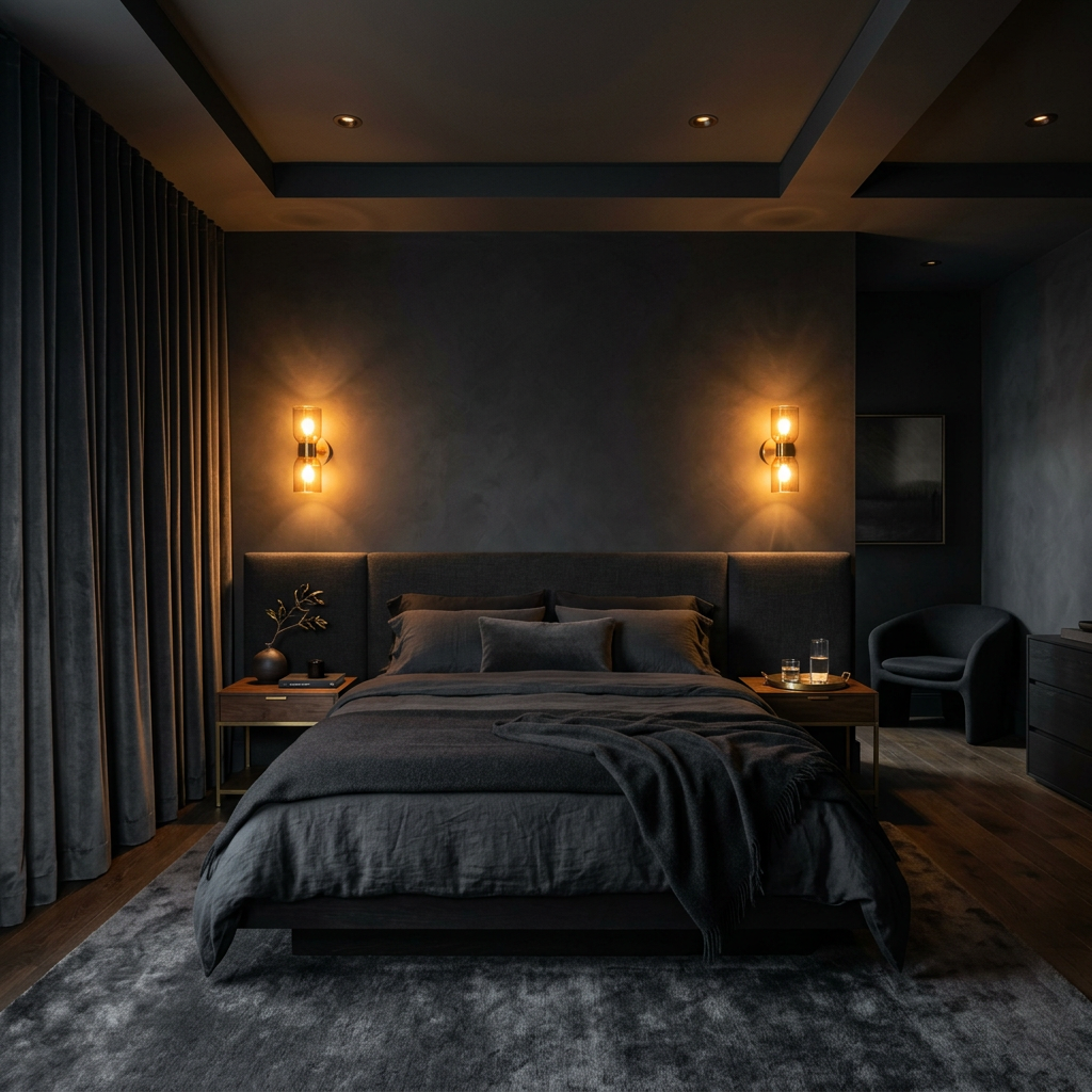
A dark bedroom done well is one of the most dramatic and most satisfying rooms in residential design. Done poorly, it feels heavy, oppressive, and small. The difference between the two isn't the darkness — it's what the darkness is doing and how the light works within it.
At Interior Design Awards (IDA), dark and moody bedroom submissions consistently earn some of the highest community votes. Here's what separates the ones that land from the ones that don't.
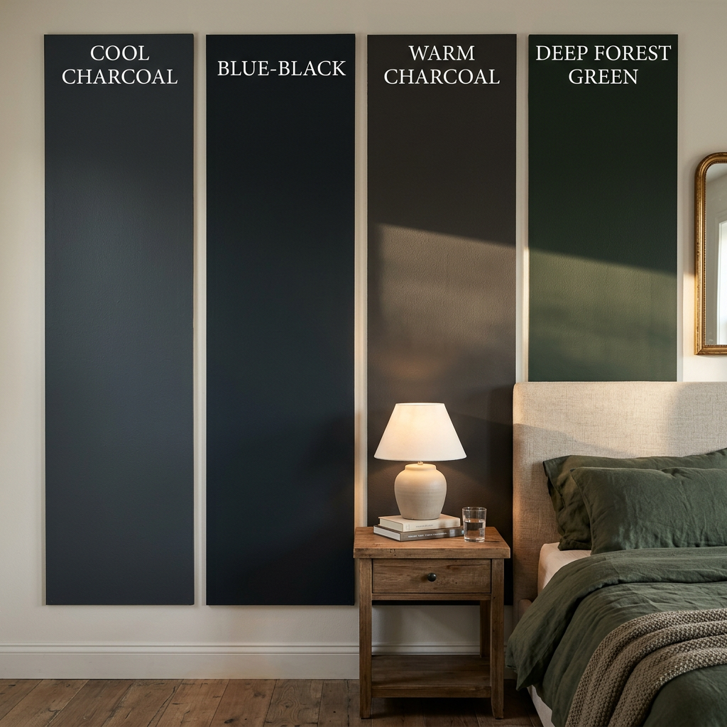
Not all dark colors create the same atmosphere. The dark bedrooms that feel warm and inviting use colors with warm undertones — charcoals with brown or green in them, deep forest greens, dark warm navies, near-blacks that lean toward brown. The dark bedrooms that feel cold and clinical use colors with cool or blue undertones — blue-grays, cool charcoals, blue-blacks.
This distinction is subtle on a paint chip and significant on four walls. Before committing to a dark bedroom color, test it in large swatches on the actual wall under the actual lighting conditions of the room. Dark colors look dramatically different in morning light, evening light, and artificial light. A color that reads as warm and intimate in the evening may read as cold and heavy in the morning.
The most successful dark bedroom colors in IDA submissions: warm charcoal (Farrow & Ball Railings or equivalent), deep forest green (Studio Green or Calke Green), dark warm navy (Hague Blue), and near-black with brown undertone (Off-Black). All have warmth built into them. None are pure cool grays or blue-blacks.
Dark rooms live or die by their lighting. In a light-colored room, average lighting is acceptable. In a dark room, every light source is visible, every shadow is deliberate, and the quality of the light determines whether the room feels atmospheric or gloomy.
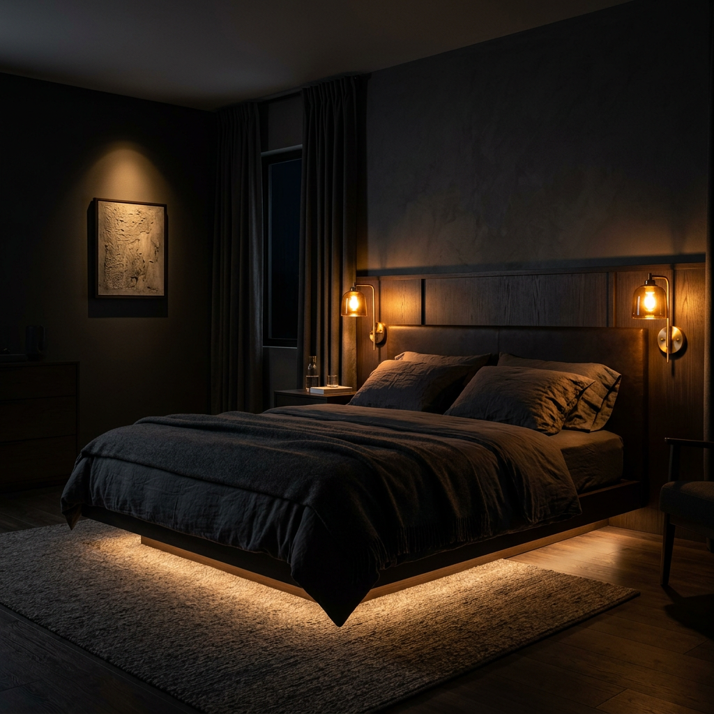
The principle: multiple small warm light sources distributed through the room, rather than one or two larger sources. Each light source creates a pool of warmth that contrasts with the darkness around it — this contrast is what creates the moody, cinematic quality that dark bedrooms are capable of.
Essential sources for a dark bedroom: bedside wall sconces at reading height (warm, directional, one per side), an LED strip concealed under a floating bedframe or beneath a floating shelf (creates a levitation effect and warms the floor plane), and one accent light — behind an artwork, inside a built-in alcove, or beneath a statement object on a nightstand.
No overhead ceiling fixture as the primary light source. A single ceiling light in a dark room eliminates the atmosphere immediately — it makes the room feel like a dark cave with a light in the middle rather than a cocooning sanctuary with deliberate pools of warmth.
In a light room, color does a significant portion of the visual work. In a dark room, with color compressed into a narrow dark range, texture becomes the primary sensory interest. A dark bedroom with flat, uniform surfaces — even in expensive materials — feels heavy and dull. A dark bedroom with varied textures at every surface feels rich and alive.
The texture layering for a dark bedroom: a tufted or channeled headboard in velvet or textured fabric (the depth of tufting creates shadow and dimension), linen or waffle-weave bedding with visible natural texture (not smooth cotton sateen), a chunky wool or bouclé throw, a dark wood nightstand with visible grain, and a ceramic or concrete lamp base with a matte, slightly uneven surface.
Each of these materials responds differently to warm light — the velvet develops sheen where the light hits it, the linen shows its weave, the wood grain becomes visible, the ceramic glows slightly. Together they create a room that's visually interesting at every distance, which is what keeps a dark room from feeling oppressive.
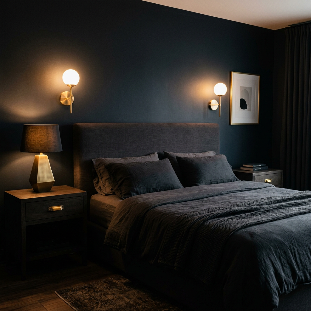
Dark bedrooms need a warm metal to prevent the darkness from becoming uniform. Brass — specifically brushed or antique brass rather than polished — is the metal that works best with dark interiors because it carries warmth in its tone that chrome and nickel don't.
A brushed brass wall sconce against a deep charcoal wall creates a visual contrast that feels deliberate and refined. The same sconce in chrome against the same wall feels cold and disconnected. The metal's warmth echoes the warmth of the dark wall's undertones and creates a coherent palette rather than a contrast.
The application: wall sconces, nightstand hardware, picture frames, lamp bases, door handles. Using the same brushed brass or antique bronze finish consistently across all metal elements in a dark bedroom creates visual coherence. Mixing warm and cool metals in a dark room — already a compressed color environment — creates the kind of low-level visual dissonance that makes a room feel slightly off without a clear reason.
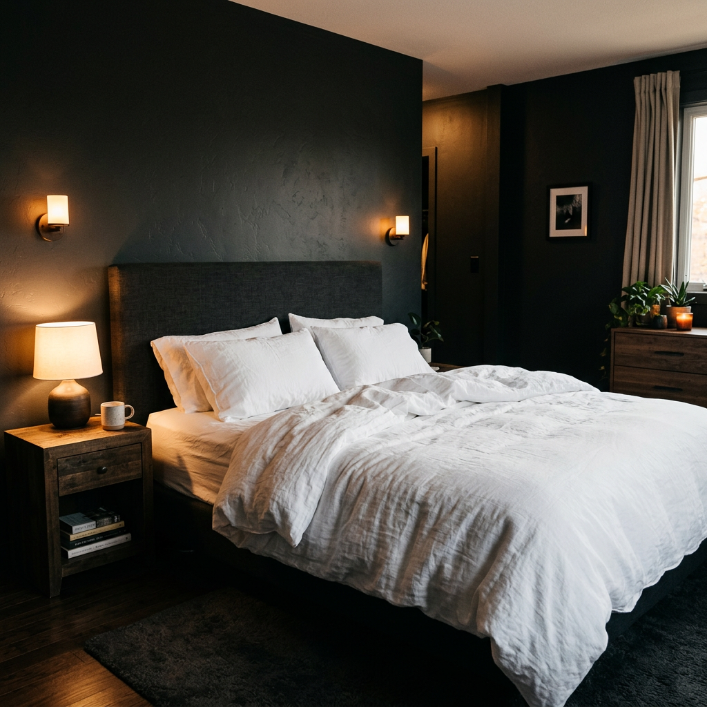
Every successful dark bedroom has at least one element that's deliberately light — and that element becomes the visual anchor of the room.
The most common and most effective: crisp white or warm cream linen bedding against a dark headboard and dark walls. The contrast is immediate and high — the bed reads as the brightest element in the room, which makes it visually central and prevents the darkness from feeling uniform.
Other options: a large light-toned artwork on the darkest wall (a pale abstract painting, a large-format black and white photograph with significant white space), a natural oak or light stone nightstand against dark walls, or floor-to-ceiling curtains in cream or ivory that lighten one entire wall.
The principle is the same in each case: dark rooms need a point of visual relief. Without it, the eye has nowhere to rest and the room feels enclosed rather than cocooning. With it, the contrast between dark and light becomes the room's primary design gesture — and that contrast is what photographs most dramatically and what the IDA community responds to most strongly.
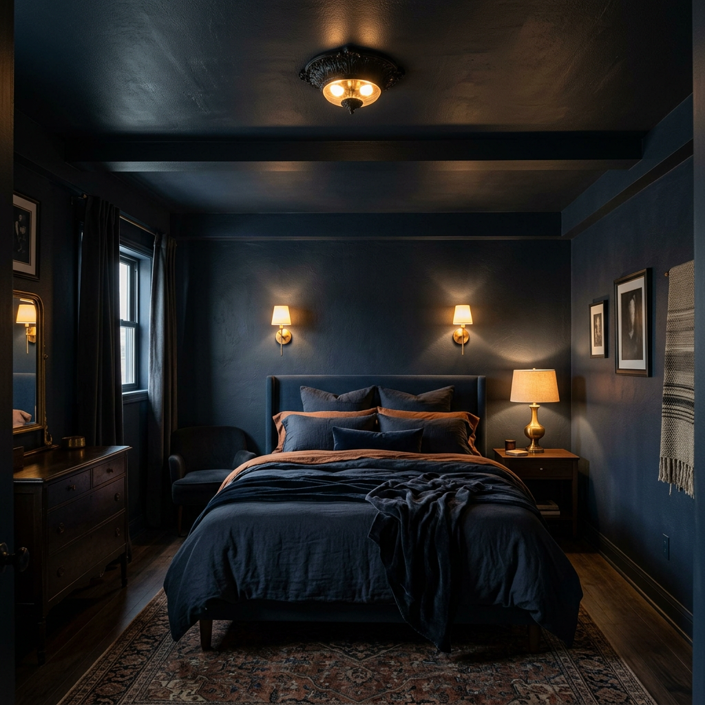
Most dark bedroom attempts stop at the walls and leave the ceiling white. This is the single decision that most often undermines the moody quality the designer was trying to create — a dark room with a white ceiling reads as a room that's been half-painted rather than a room that's been designed.
Painting the ceiling the same color as the walls, or a slightly darker version of it, creates a fully enclosed atmosphere — what some designers call the "jewel box" effect. The room becomes a contained environment rather than a dark-walled box open to the ceiling above. This is what creates the cocooning quality that makes dark bedrooms feel like sanctuaries rather than caves.
The practical concern is ceiling height — dark ceilings lower the perceived height, which can make a room feel cramped in spaces with standard 8-foot ceilings. The counterintuitive solution: warm lighting that pools toward the walls and floor draws the eye down and makes the ceiling feel less present, not more. A dark room with warm downward light can feel more spacious than a light room with a single ceiling fixture.
A dark bedroom requires more deliberate decision-making than a light one — not less. Every light source is more visible. Every texture matters more. Every metal finish contributes or conflicts more directly. The palette has less room for error.
The dark bedrooms that earn the strongest IDA community votes are the ones where this deliberateness is visible. Not rooms that are simply dark — rooms that are designed to be dark, with every consequence of that decision resolved intentionally.
Every month, designers submit their best bedroom projects on Interior Design Awards. The community votes, and the top 3 earn recognition and cash rewards.
→ Browse this month's bedroom submissions
→ Submit your dark bedroom design
Interior Design Awards (IDA) is a platform where designers share room projects, the community votes monthly, and the top designers earn recognition and rewards. Based in the US, open to designers worldwide.